
Impact: The app made users feel like Karate Kai really thinks about how to meet their needs.
One quote from peer feedback: "Overall the experience was very user friendly, I believe that people of all ages with some relative technology background would be able to use this and make it work." - Participant 5/5
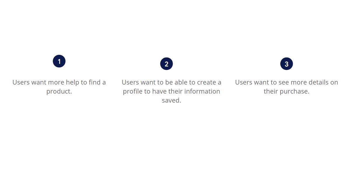
What I learned: While designing the Karate Kai app, I learned the first Ideas for the app are only the beginning of the process. Usability studies and peer feedback influenced each iteration of the design.
If you like what you see and want to work together, get in touch!
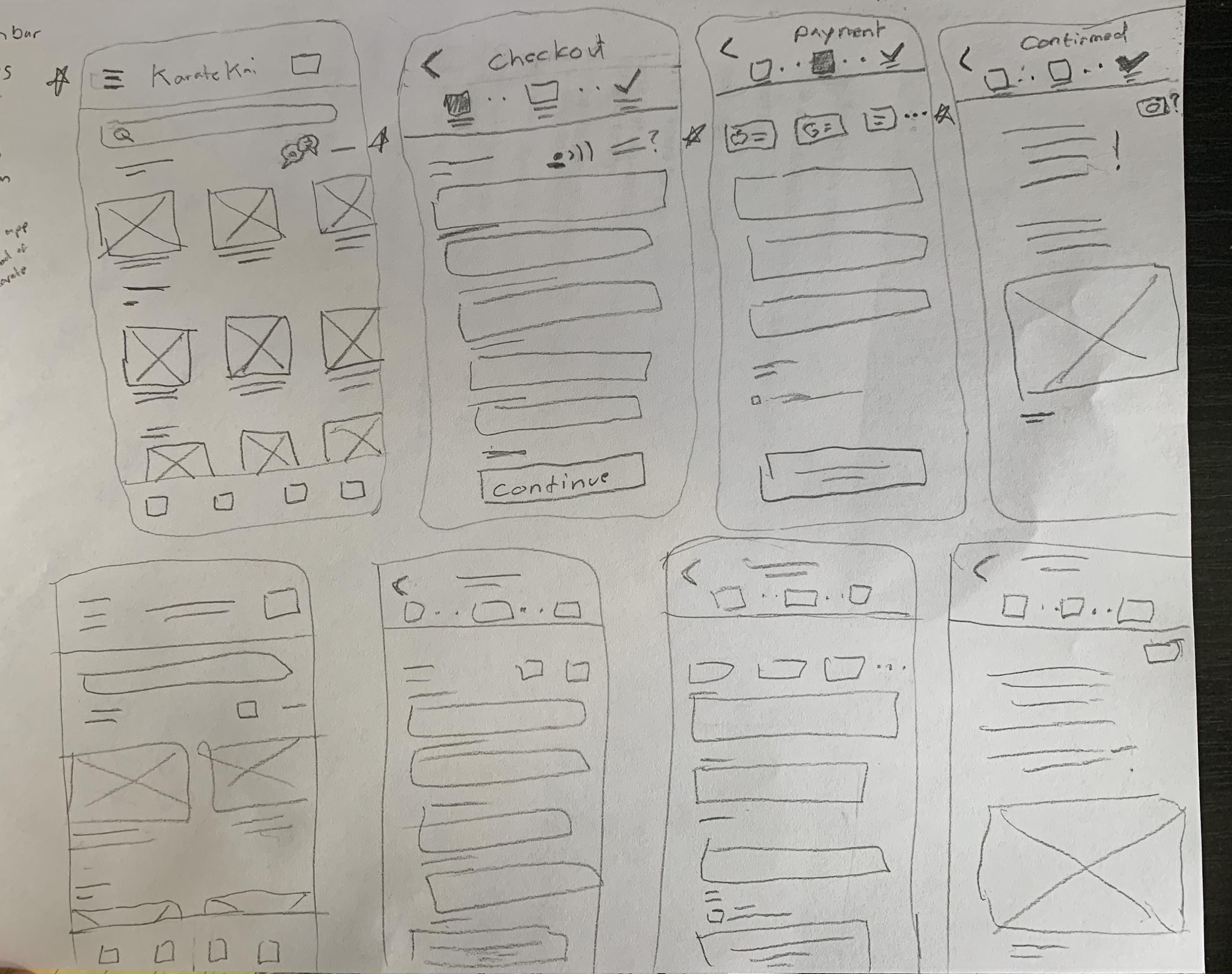
sebastianqma@gmail.comMockups, Wireframes and Prototypes made with Figma.