Stock Trade

Responsive Website
Project Overview
Stock trade is a trading and investing platform that allows users to buy/sell, invest and trade stocks while also providing learning opportunities for new users.

The problem: Users want a platform to find reliable and accurate information with 0 to low trading cost on stocks for their personal needs.

The goal: Users will create an account that assesses them on their trading knowledge and experience to have tailored access to these services.
My Contributions
My role: UX Designer, designing and researching this trading platform from conception to delivery.

Responsibilities: User research, paper and digital wireframing, low and high fidelity prototyping, Usability testing, and Interviewing.
Project Overview
When I conducted interviews, I found users such as older adults that like to make additional revenue to save for their own personal gain was a primary group identified. I also discovered many users do not access stock trading platforms and instead open personal banking accounts because it is easier especially for residents of their home country and also because of confusing layout, minimal info and risky security.


Pain Points

Persona
Sitemap
Initially when creating my sitemap users will start in the home page and the different tabs presented would be their navigation through the website if they do not create an account.
Paper Wireframes
I started ideating different layouts for the home screen to find out which would be more understandable to new and experienced users. The stars presented the ideas I enjoyed the most.

Screen Variations
When I was creating ideas for screen size variations I wanted to know how my homepage idea in the end would look on mobile. I used a grid to keep my ideas organized and this was the result.


Digital Wireframes


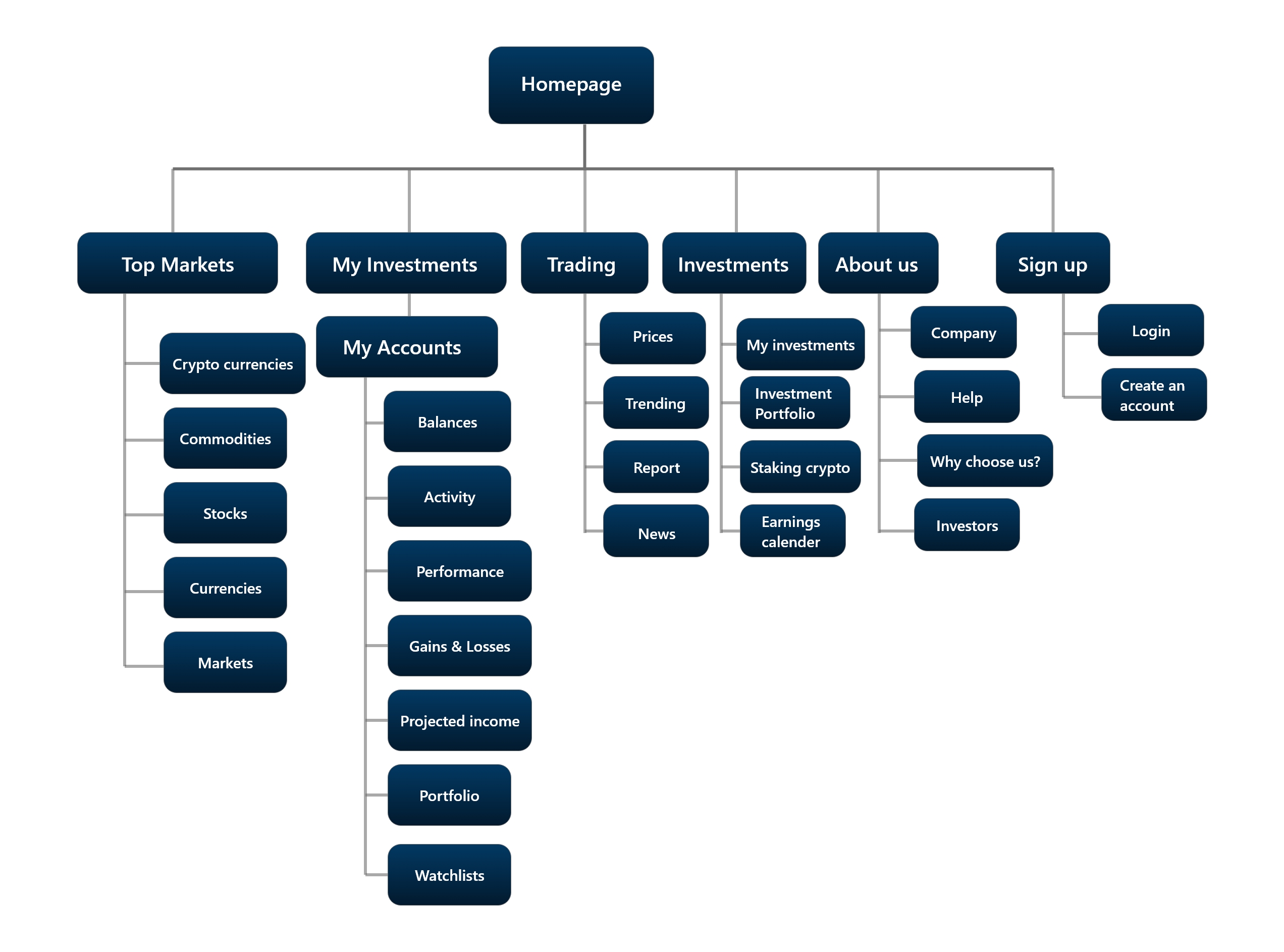
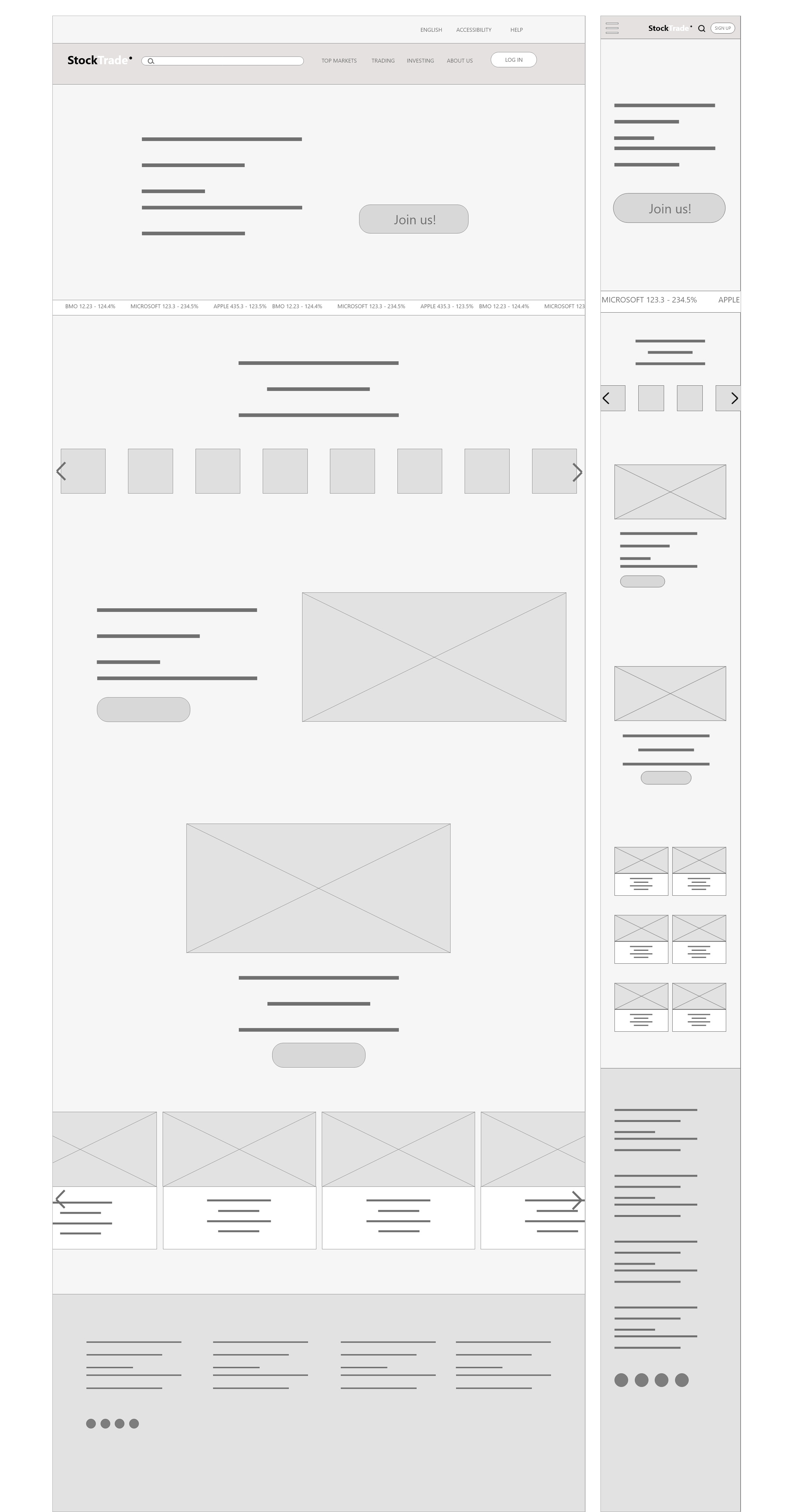
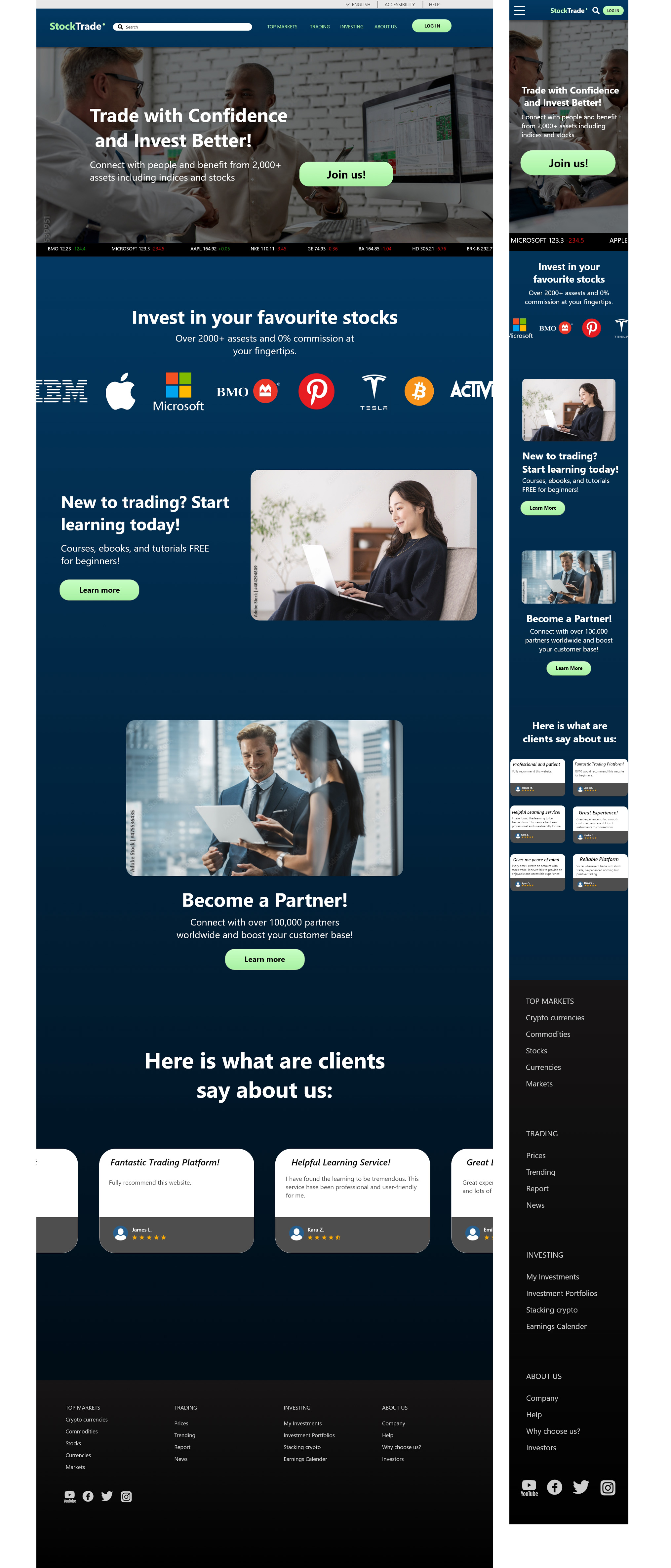
I decided on creating my homepage based on what would be more appealing to users and what they need to see first. A single image is a trend for most stock exchange websites.

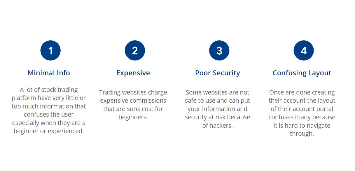
My goals were to advertise accurate information and ensure security by presenting the information in an organized understandable way that would make users want to create an account and let them know that new and experienced users can have tailored benefits when creating an account.

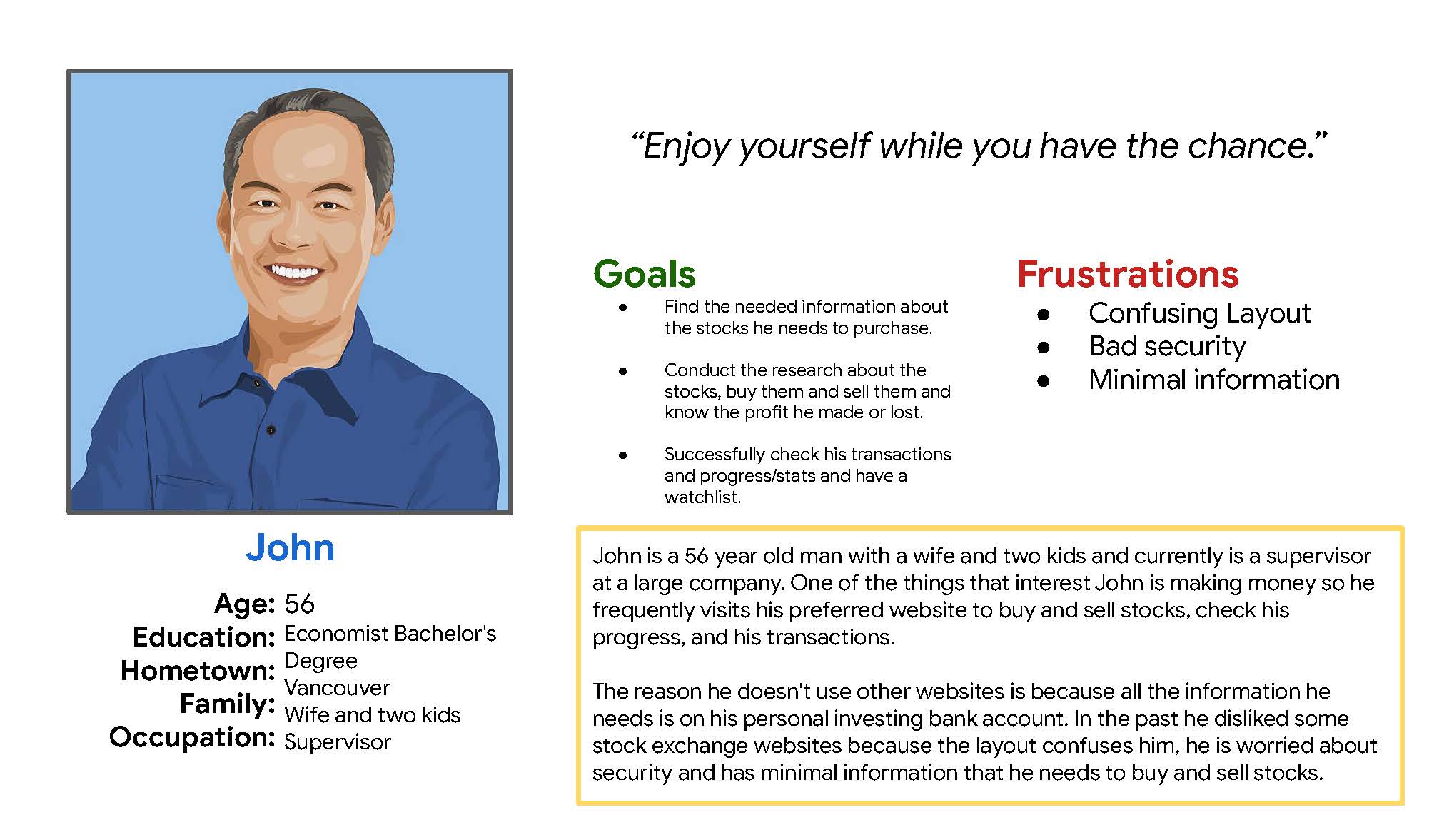
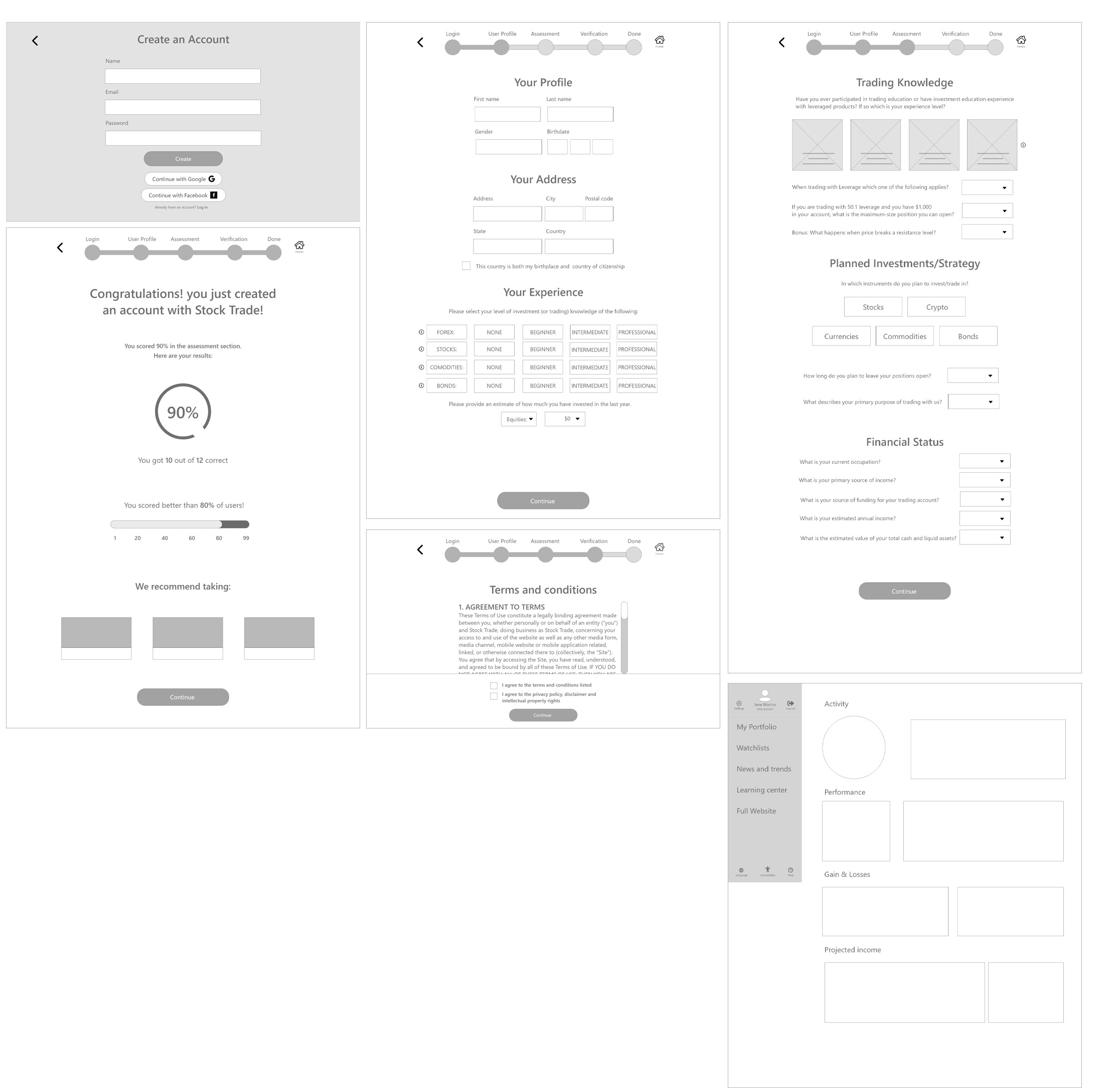
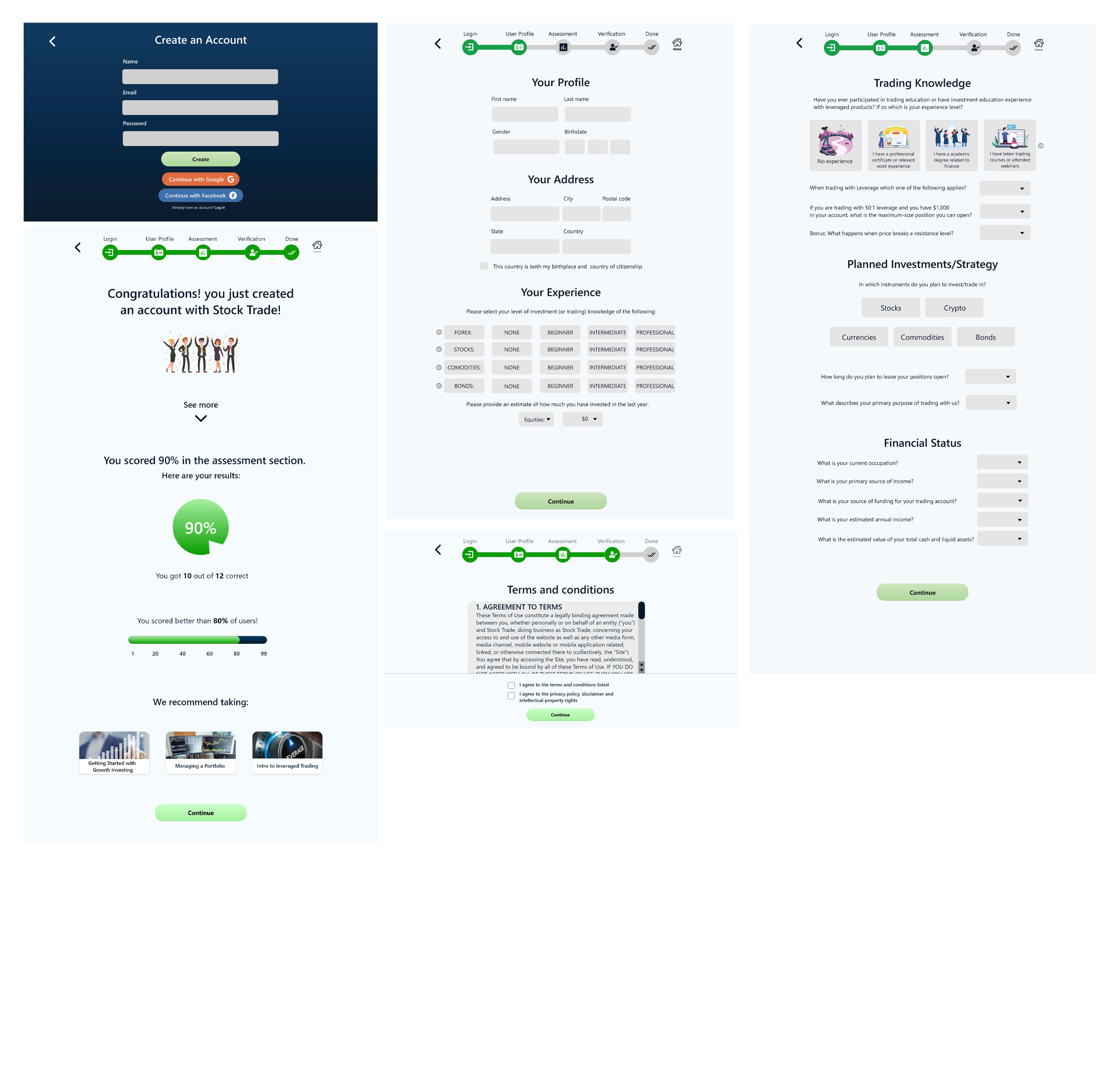
User flow begins by creating an account and going through a profile, assessment, verification and then a final analysis of their experience trading.

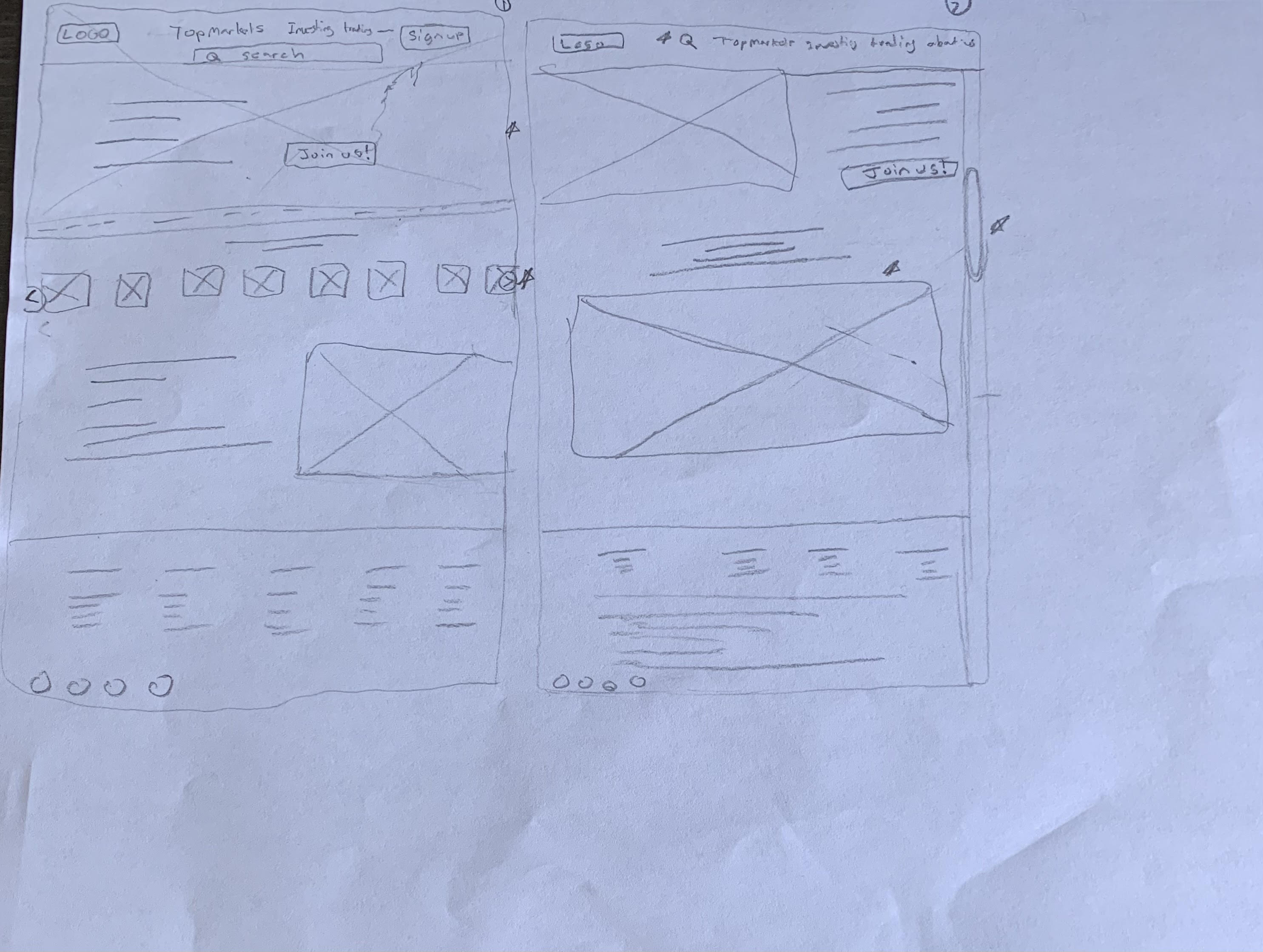
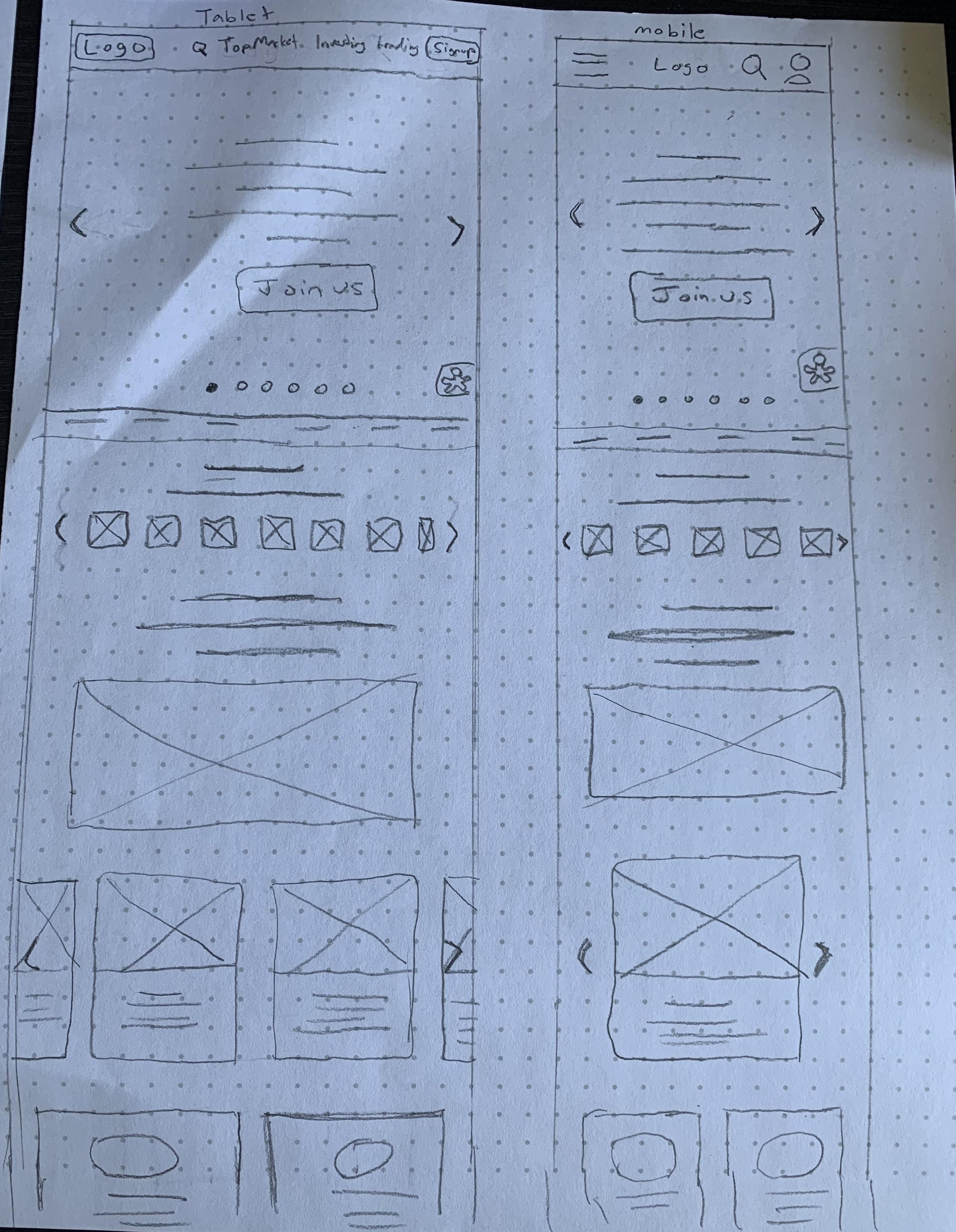
low fidelity prototype here


Usability Findings

After conducting a usability study, users experienced some technical issues that they would like fixed or added. Here are the top findings.


Mockups

My goal was to make the homepage attractive and functional for users, some feedback includes users were confused with “Sign up” instead of “login”. Users also enjoyed the ticker of stocks at the bottom so I kept that as well.

Users found the "Create a profile" page the most easy to use and understandable because of its simplicity, so I wanted to maintain that in the mock-up.

User flow is mostly the same just with updated high fidelity designs and implemented user feedback from usability test.

High fidelity Prototype here


Takeaways

Impact: My target users shared that as a low-fidelity prototype and as a high fidelity prototype, the design functioned easily for them and are looking forward to creating a profile to see what my website has to offer.

Quote from peer feedback: "The sign up process was very easy and accessible, I can easily complete all my personal data” - Participant 3/5

What I learned: I learned that knowing your users and conducting research beforehand is vital to creating any design, I learned a lot about creating a responsive website design and investing/trading stocks as well.

Mock-ups, wireframes, prototypes made with Adobe XD.

View Case Study